
Depop App Redesign

Depop is a social shopping app and website where people can sell and buy unique, brand new, and second-hand products such as clothing, accessories, unique pieces etc. What makes Depop unique is that it is not only a website to sell and buy items, but also includes social interaction between people.
Tools used: Adobe XD
Website: Depop
Problem 1: Only one option to select for a size per item. This is a problem because some clothes may fit between sizes.

Solution: What I feel would be more useful to users would be allowing sellers to pick up to multiple sizes because not all clothes match a certain size. This can be beneficial for both the buyers and sellers along with the company Depop with increasing sales as the item selling would be applicable to a wider range of people.
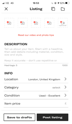
Problem 2: Depop only allows up to 4 photos of the item. This is an area of weakness because it prevents users/sellers from being able to identify the item properly. This is because some pieces of clothing such as a detailed jacket, with details on the front, back and sides need the option of providing more photos of the specific areas, so users have a better understanding of what they are buying.

Solution: Include up to 6 photo options. Such as for front (1st), back (2nd), side 1 (3rd), side 2 (4th), tags/size (5th) and any other small detail or fault with the item for the 6th photo. This increases the likelihood of users to be more satisfied with their purchase. Happy buyers mean better reviews, meaning increasing sales and profit for not just the seller but also Depop.
Problem 3: The one-page form fill when listing an item. The areas of weaknesses for this are that it can be difficult for the seller to keep in mind all the different details to include of the items. This one-page form fill can cause the seller to make mistakes and find harder to focus on all the different selections.
Solution: Change the one-page form fill to a step by step form filling. Such as, a pop up for each step as this would help the seller to stay focused and present clear information of the item, without it being time consuming.
Competitor Analysis
Direct competitors: Vinted and Poshmark
Indirect competitors: Amazon, Etsy and Thredup

Design process

Original form-fill before:
Form-fill after re-designed in step by step form filling:

Low-fidelity Wireframe

High-fidelity Wireframe

High-fidelity prototype:


